


Markets pulled back aggressively of late, with risk sentiment taking a hit from the duo catalysts of a stronger USD and higher bond yields.
I wrote here on 12 August that a stronger USD looked imminent, and that if this scenario materialized, equity markets will likely be vulnerable. That has been accurate so far, with the inverse correlation between the USD and equities holding firm.
From here, I have noticed a peculiar divergence that stands out. This could be a clue on the next big move in the markets.
The gold-to-copper ratio is actually testing the breakout zone of a multi-month base. As we can see from the weekly chart below, the ratio has been basing since December 2020, and we are now at the critical pivot. If the breakout materializes, we could see a period of outperformance in gold, relative to copper.
Weekly Chart: Gold-to-Copper Ratio
TradingView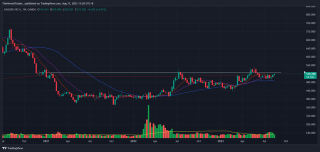
This is important, as the leading narrative of higher inflation (stronger USD, higher yields) should theoretically lead to this ratio dropping like a rock. If inflationary pressures were running high, copper should be massively outperforming gold.
This is because copper is a cyclical metal that outperforms when the economy is running hot. Gold is highly sensitive to interest rates, and typically does not fare well when USD and bond yields are running higher.
Taking a closer look at the gold-to-copper ratio, spot copper prices are actually breaking down, and building bearish distribution patterns. We can observe this from the weekly chart of spot copper prices below. Selling pressure is high in a metal that tends to outperform in an inflationary environment. Very curious indeed.
Weekly Chart: Copper
TradingView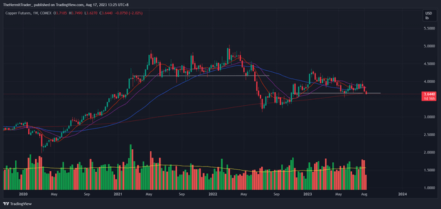
It is worth paying attention to this divergence, because the market tends to provide clues on its next big move. One example of this would be the strength in the USD and bond yields. Both started to march higher and breakout above key pivotal levels in mid-July, and this new trend overcame the older trend – the equities rally.
In this case, the leading narrative is now on a stronger USD and higher bond yields. Inflation is expected to be difficult to tame. However, we may be at the onset of a new trend, where gold starts to outperform copper, signaling lower inflation going forward.
What tends to outperform if inflation is not as high as previously feared?
- Equity sectors like real estate / REITs, due to falling interest rates
- Precious metals like gold and silver, due to falling interest rates and weaker USD
- Bonds, due to falling interest rates
I want to focus on REITs in particular.
In Bank of America’s Global Fund Manager survey, it shows investors capitulating on REIT positioning. Investors are shunning REITs, to the extent that we are at 2008 extremes.
Bank of America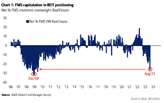
This is a huge opportunity in my view, especially if inflation and interest rates start to decline.
The Real Estate ETF I am watching closely is the SPDR Real Estate ETF (NYSEARCA:XLRE), which invests in US real estate stocks. Extremely bearish positioning does not equate to a golden opportunity right away. Timing is still key, and falling knives can be dangerous.
On the weekly chart of XLRE below, we can see that the ETF is almost in free fall, trading below all key moving averages (10, 20, 50, 200 period). I want to see price action firm up first, before considering an entry. We may need to see capitulation first, marked by high-volume sharp selling, to really scare off the remaining investors.
Weekly Chart: XLRE
TradingView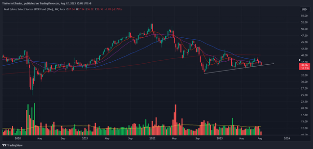
Alongside XLRE, three correlated charts I am watching closely for clues are Treasury bonds (TLT), the dollar index, and the US 10 year Treasury yield. When all these charts show the same message, coupled with a breakout higher in the gold-to-copper ratio, this would indicate a strong probability of a bottom in REITs.
Treasury bonds are still in free fall, and do not look ready to rebound yet.
Weekly Chart: TLT
TradingView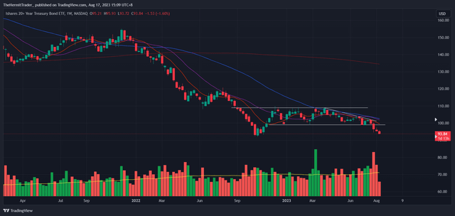
The Dollar Index has just recovered from a false breakdown below the 100.50 pivot. From false moves come fast moves in the opposite direction. I think there is still more fuel in this USD rally.
Weekly Chart: Dollar Index
TradingView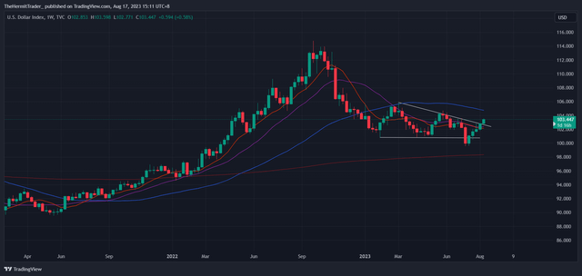
The US10Y Yield is on the verge of breaking out to new highs. No sign of stalling yet.
Weekly Chart: US10Y Yield
TradingView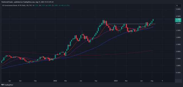
In essence, I need to see confluence on the aforementioned correlated charts first, before dipping into the REIT space. I am cognizant that there is huge potential for XLRE to rebound.
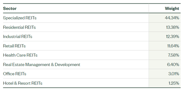
More information on XLRE – the fund holds US real estate stocks, with Prologis (PLD), American Tower (AMT) and Equinix (EQIX) making up the top three holdings (roughly 30% in total). The sector mix is pretty diverse.
State Street State Street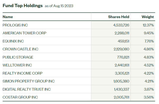
Looking at the longer term chart, XLRE is about -30% below its all-time high made in 2022. This ETF has lagged many others this year, with the majority of the broad market putting in strong rallies in 2023. There is potential for XLRE to catch up if the macro tailwinds are in its favor.
Monthly Chart: XLRE
TradingView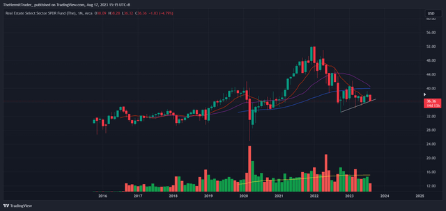
As you can see, the ETF is up about +3.8% YTD, which is not spectacular, given the S&P 500 (SPY) is up +15%. XLRE tracks its benchmark fairly well.
State Street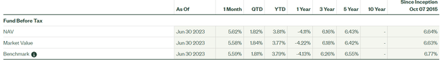
XLRE has an estimated dividend yield of 3.85%, which is a bonus in holding the ETF. However, I am more concerned with the potential gains if the entry is timed perfectly.
Overall, I think XLRE is a good vehicle to express a long view in a very beaten down sector, which is near historical-extremes in terms of capitulation. This is a huge opportunity, but the timing has to be right. Falling knives are dangerous to catch. I plan to improve my odds on timing my entry by looking for confluence in correlated charts.
Read the full article here