

Hi, my name is Austin, and I’m a chartaholic.
I love words, don’t get me wrong, but nothing can communicate the narrative behind data like a chart.
Every week in articles like this, I share a selection of the most interesting charts that have crossed my screen while offering some commentary to make sense of them. The goal is to learn a thing or two about the economy in the process of becoming a better investor within it.
Let’s get to it then.
Here’s where we’re going today:
- US manufacturing appears to be in recession… again
- Labor market weakening continues
- The inverted yield curve is a forewarning, but the un-inversion of the yield curve is the true indicator of impending recession
- Defensive stocks are quietly trouncing the market this year
- Musings on the Verizon acquisition of Frontier
- Where the buy list stands today
Onward.
Returning To The Pre-Pandemic Manufacturing Recession
I’ve written in recent weeks about the negative effects of the 2018-2019 tariffs on US manufacturing.
A simplistic understanding of trade would have you believe that higher tariffs on foreign goods automatically benefits US manufacturers of those goods as US businesses switch from foreign to domestic suppliers.
But the world is more complicated than that. The US manufacturing sector (the second largest in the world, behind only China) has spent decades becoming increasingly integrated into global markets and supply chains. About 25% of all imports are industrial suppliers (raw materials and intermediate products) used in the production of goods here in the US of A.
This global integration has made the economy more efficient, more productive, more prosperous — with the happy side effect of lifting hundreds of millions of people out of poverty in developing nations but also the unhappy side effect of eliminating millions of manufacturing jobs in the US.
What happens when politicians try to undo decades’ worth of global supply chain integration with the dubious belief that trade wars are easy for the bigger economy to win?
We see the answer, starting in Q3 2018: a sharp drop in the US manufacturing purchasing managers index (as well as a decline in output and a halt in job growth, as I’ve shown in previous articles).
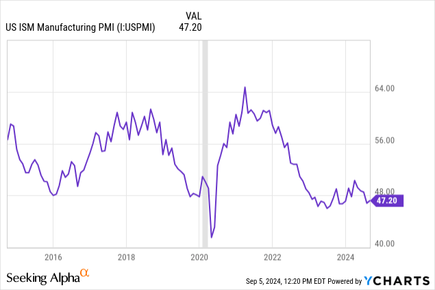
Anything below a reading of 50 is contraction in the ISM’s PMI indices.
The weakness we are currently seeing in US manufacturing is really just a return to pre-pandemic conditions. The vast majority of tariffs implemented in 2018-2019 remain in place. These continue to cause headaches for US manufacturers, and newly implemented tariffs on Chinese solar panels, cars, and other goods have only added to the problem.
Also, part of the problem is the softening of consumer spending in the US as well as economic weakness in other parts of the world that are reducing demand for American-made goods.
In any case, I think it’s fair to say that the post-COVID boom in US manufacturing is more of an anomaly than the weakness being experienced today.
Of course, the US manufacturing sector simply isn’t as big a part of the US economy as it used to be.
Manufacturing jobs as a share of total employment has fallen from about 1/3rd at the end of WWII to a little under 10% today.
Datastream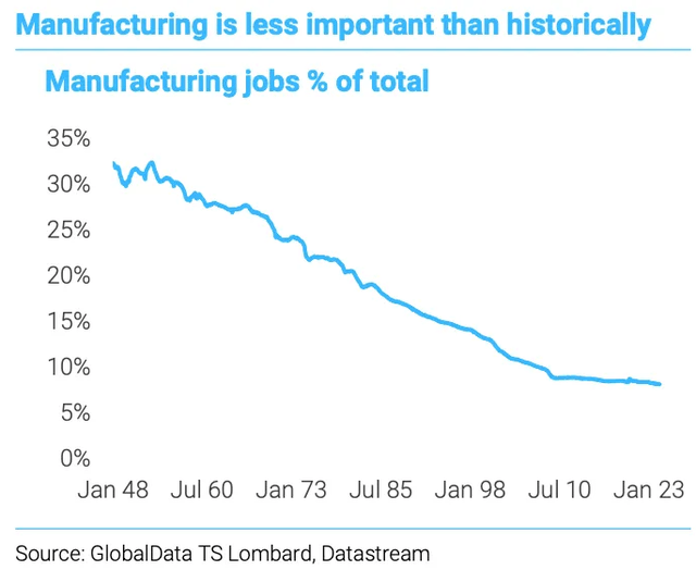
Manufacturing jobs have been shrinking as a share of total employment in the post-war period because of technology improvements, which reduce the number of humans required for the manufacturing process.
Could you point on the above chart to the year that NAFTA went into effect? Or when China was admitted into the World Trade Organization?
Interestingly, major free trade agreements are not noticeable when it comes to manufacturing’s share of total employment.
Perhaps the better question to ask is why the downward trend from about 1950 to 2010 was halted after the GFC.
Maybe there isn’t much more viable automation and robotization to be done in the manufacturing sector. Or maybe after the GFC, the level of government debt and deficit spending began to crowd out private investment. Or maybe the GFC destroyed or outsourced the last bit of low-skilled manufacturing jobs in the US. Maybe a bit of all three.
The Labor Market Continues Its Downward Trends
The ADP private payroll report for August was just released, showing the smallest increase in jobs since early 2021.
According to ADP, payrolls grew by 99K jobs in August, compared to estimates of 140K. Also, ADP’s July jobs growth was revised down to 111K from 122K.
Small businesses are shedding jobs, while medium and large businesses are still growing their workforces. Meanwhile, the education, healthcare, and construction industries were hiring in August, whereas professional/business services and manufacturing were both shedding jobs.
The ADP report corroborates the recently released JOLTS report, which likewise showed the lowest number of available jobs since January 2021.
Daily Chartbook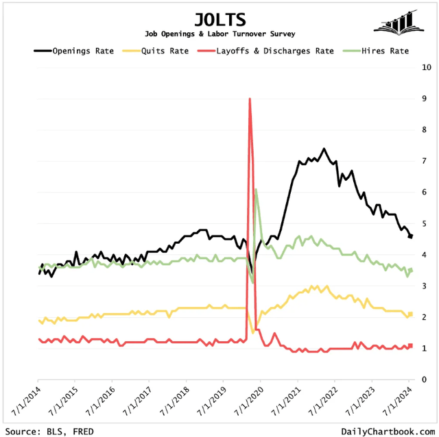
Job openings are collapsing, following their trend since the peak in mid-2022.
Hiring and quitting have also slowed to a little below their pre-pandemic rates, but the good news is that layoffs have basically not increased at all.
The whole reason why the unemployment rate has risen is because hiring has slowed while growth in jobseekers has not.
Does this mean a recession is a long way off if one is coming at all?
No, not necessarily. For example, in the GFC recession, job openings began rapidly declining at the beginning of 2008, corresponding to the (retrospectively applied) official beginning of the recession, while layoffs didn’t begin to meaningfully increase until mid-2008 — about 1/3rd of the way through the official recession.
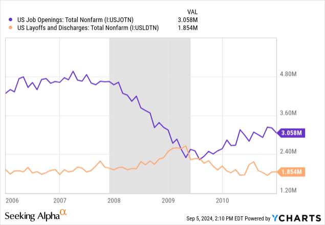
The same thing happened in the early 2000s recession: Job openings fell over the course of the recession, but layoffs didn’t spike until the final stage of the recession.
In most cases, there’s no widespread consensus that the economy is currently in recession until well after the recession begins.
Beware The Un-Inversion of the Yield Curve
It’s fairly well known that an inverted yield curve (10-year minus 2-year Treasury yields) is a forward indicator of recession.
Dr. Campbell Harvey, inventor/discoverer of this indicator, says that this is both correlation and causation.
It’s correlation because it is a signal of the market’s expectations for where interest rates are going at various points in the future.
But to a degree, it’s also causative because the economy doesn’t function as well when long-term interest rates are lower than short-term interest rates. For example, bank lending becomes inhibited when the spread between loan yields and their cost of funds narrows.
However, Dr. Harvey is quick to point out that an inverted yield curve is by no means mechanical and can’t predict when exactly a potentially oncoming recession will arrive. It could be less than a year or almost two years after a sustained inversion is reached.
It is really the un-inversion of the yield curve that signals an impending recession. It did in the last three recessions going back to 1990 (not counting the unique case of COVID-19).
YCharts, Modified by Author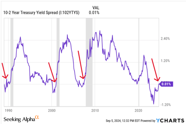
As you can see, the 10-year minus 2-year yield curve just un-inverted from its prolonged inverted state.
If the record of history holds this time as well, this is a signal that a recession will arrive in the near future.
However, an arguably more accurate recession indicator is the inverted 10-year minus 3-month Treasury yield spread. Or, rather, the un-inversion of this spread.
As for the 10-year minus 2-year spread, the un-inversion of the 10-year minus 3-month spread is historically coincident with the beginning of recession — or leading by at most a handful of months.
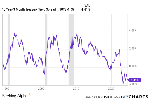
As you can see, the 10-year minus 3-month spread remains deeply inverted and is not yet trending toward un-inversion.
An un-inversion caused by a sharp rise in the 10-year yield would be considered a “bull steepening,” because long-term bonds selling off to that degree is almost always accompanied by robust economic growth.
What really causes the “bearish steepening” resulting in a recession-indicating un-inversion is a sharp drop in the 3-month Treasury yield from investors bidding up the price of 3-month T-bonds. That only happens when the market expects rapid Fed easing in the near future, and rapid Fed easing is almost always spurred by an economic downturn.
Interestingly, the 10-year minus 3-month Treasury yield spread is not signaling that recession is imminent yet.
That doesn’t mean we can all wipe the sweat from our brow and celebrate the soft landing. It’s only a soft landing until you collide with the ground.
What I think the inverted yield curve indicator really demonstrates is the utter normalcy of economic cycles.
A lot of people, including professional economists and market pundits, talk as though the natural state of the economy is an equilibrium of average growth and that after the temporary disruption of COVID-19, we are now “normalizing” back to that equilibrium.
I object.
The economy moves in cycles. Recessions are part of the cycle. They always have been, ever since the Industrial Revolution and the advent of capitalism.
Will this time be different? It seems more reasonable to assume that it won’t.
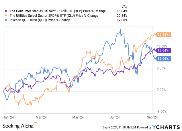
Defensives Are On Fire
The stock market certainly knows about the risk of near-term recession. Stocks are in typical “late cycle” mode, still rising but definitively shifting toward defense rather than offense.
In other words, the growthier sectors are now taking a back seat to recession-resistant sectors like consumer staples (XLP) and utilities (XLU). Year to date and especially in the last few months, XLP and XLU have outperformed the top-heavy S&P 500 (SPY) on a price basis (even more so on a total return basis):
But, of course, not all defensive stocks are performing equally well. Some are really stepping on the gas.
Take, for example, Big Tobacco — Altria (MO) and Philip Morris International (PM) — which have more than doubled the price performance of the S&P 500 this year.
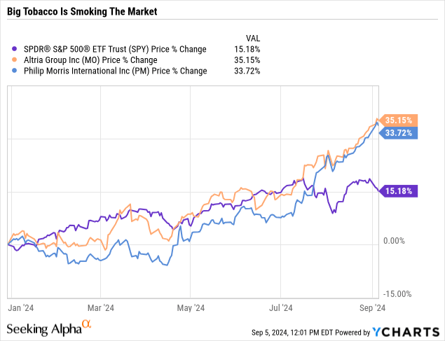
MO’s P/E ratio is now 13% above its 5-year average, while PM’s P/E ratio is 22% above its 5-year average.
Did I miss a headline about cigarettes being declared healthy or something?
I don’t think so. I think, instead, that investors are rotating into a select group of defensive names en masse.
These high-quality defensive stocks are becoming really crowded, and their valuations are becoming pretty stretched, in my view.
Here are a few more defensive winners: Walmart (WMT), Unilever (UL), and Coca-Cola (KO), all beating the market YTD on a price basis alone. (Not including dividends.)
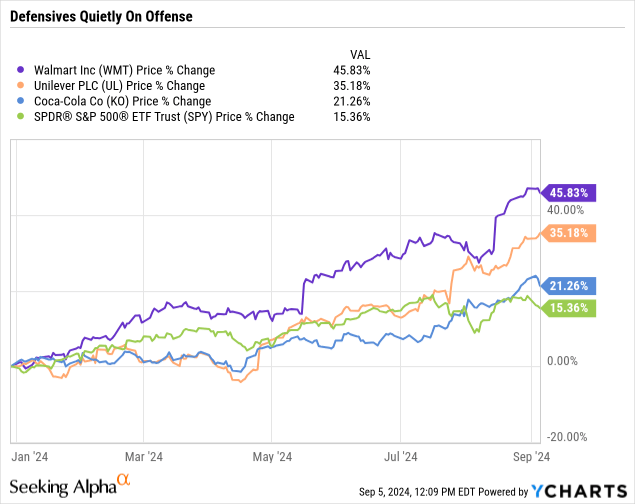
Down with tech, up with staples!
But I’m definitely not a buyer of these defensive winners today.
WMT’s P/E ratio of a little over 30x is about 28% higher than its 5-year average. UL’s P/E ratio? 7.5% higher than its 5-year average. And KO? Only about 1% higher than its 5-year average P/E ratio, admittedly, but I don’t think that ~25x multiple is a reasonable price for a company with a mid-single-digit growth rate.
Verizon And Frontier, Sittin’ In A Tree…
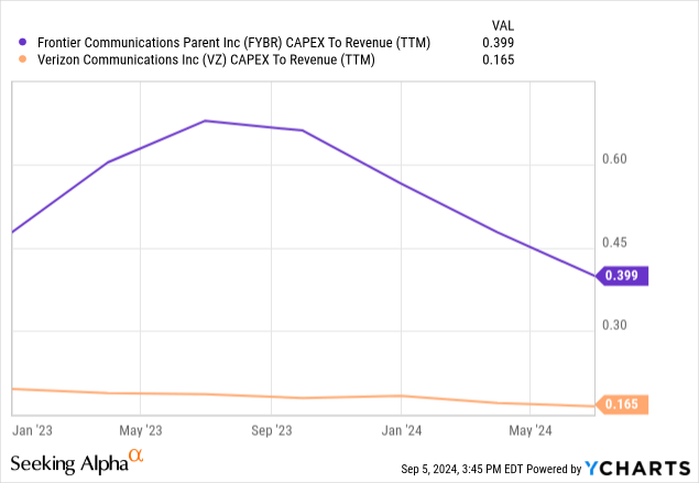
Telecommunications oligopolist Verizon (VZ) recently agreed to acquire fiber and broadband Internet provider Frontier Communications (FYBR) for a total price tag of about $20 billion.
Fiber has already been one of Verizon’s primary areas of growth for a while through its Fios service, so in a way it makes sense that Verizon would seek a big leap forward in this area by consolidating with Frontier.
Where I’m iffy is how this will affect earnings and free cash flow. The deal announcement indicated management’s view that it would be accretive to “revenue and adjusted EBITDA growth rates,” which I believe translates to the notion that the Frontier acquisition will increase the combined company’s revenue and EBITDA growth going forward.
I buy that, but how about earnings and free cash flow?
Well, FYBR doesn’t have positive earnings or FCF, but it does have a good bit more capex (as a share of revenue) than Verizon by nature of the fact that fiber is still being built out while wireless tower infrastructure is already built out.
Verizon does expect $500 million in cost synergies by year three after closing, some of which presumably will come from refinancing Frontier’s debt.
Speaking of debt, how much will this increase Verizon’s leverage?
CEO Hans Vestberg stated in a CNBC interview that Verizon’s debt-to-EBITDA is expected to rise only 0.2x-0.3x from the Frontier acquisition.
To be fair, although $20 billion sounds like a lot, the total enterprise value assumed in Frontier’s acquisition price is only about 6% of Verizon’s enterprise value and a little over 13% of Verizon’s total debt.
I haven’t yet decided what I think of this deal.
On one hand, the fiber assets make for a nice bolt-on acquisition with immediate synergies and very little overlap between Verizon’s and Frontier’s infrastructure geographies. Much of these fiber assets used to be owned by Verizon anyway. (The circle of life, playing out right before our eyes!) Verizon’s fiber network is mostly concentrated in the Mid-Atlantic and Northeast, while Frontier’s is concentrated in the West and Midwest.
On the other hand, this increases Verizon’s debt load while increasing its capex obligations, potentially eating into its future FCF.
A lot rides on whether Verizon can make Frontier’s portfolio profitable and FCF generative over time. If so, it looks like a mildly good deal.
If not, and Verizon is stuck with more debt and capex obligations, then it looks like a mildly to moderately bad deal. Generally speaking, big acquisitions like this are a lot better for the acquiree than the acquirer.
The market appears to be on the fence about it, too, given the milquetoast reaction in Verizon’s stock price so far.
The Buy List Today
As discussed in last week’s article, “My Top Investment In September As Rate Cuts And The Election Come Into Focus,” most of my investable cash is now going toward the ultra-short-term Treasury ETF in the table below. I don’t view this as a long-term holding but rather a place to earn some yield on cash with extremely low volatility while I wait for better DGI stock opportunities to come around.
That said, there are still a few dividend growth stocks that I view as opportunistically valued today. I’m still building my positions in these stocks, so I can’t but be a buyer when money is sufficiently available.
| Dividend Yield |
Projected Dividend Growth Rate (Guesstimate) |
|
| Alexandria Real Estate Equities (ARE) | 4.4% | Mid-Single-Digit |
| Chevron (CVX) | 4.6% | Mid-Single-Digit |
| Rexford Industrial Realty (REXR) | 3.3% | High-Single-Digit to Low-Double-Digit |
| iShares 0-3 Month Treasury ETF (SGOV) | 5.2% | N/A |
Another stock on my watch list over which I’m hovering like a hungry puma is Robert Half International (RHI), a temporary staffing company with zero debt and a 19-year dividend growth record.
I go back and forth on this one. It’s already down 50% from its high, and I don’t want to miss my chance. This leads me to believe I should just start buying now and average in if RHI goes lower.
On the other hand, if I actually believe a near-future recession is likely, and I do, then there’s probably further labor market weakness to come. RHI’s payout ratio has already edged up to almost 80%, and we haven’t even seen the recession yet.
The temp workforce is lower today than it has been anytime outside of the pandemic since early 2014.
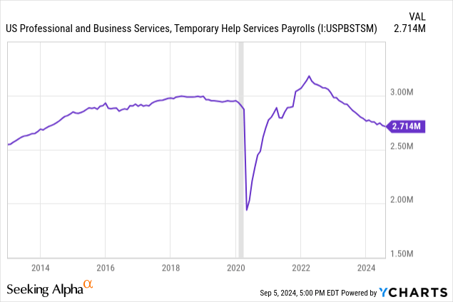
So, basically, a decade’s worth of temp jobs have been eliminated over the last few years.
I think the structural labor shortage I’ve talked about in previous articles is playing a part here. Employers are hiring the workers they like in permanent positions and then hoarding those workers. The sting of being unable to find qualified workers during the pandemic still lingers.
Then again, temp jobs also declined leading up to the GFC in 2008 and the post-Dot Com bubble recession in 2001.
Maybe the current decline in temporary staffing is just a more pronounced version of what usually happens before recessions?
I don’t know. It’s hard to pull the trigger on buying RHI when I don’t have confidence that a robust recovery in temp staffing will come.
The Return of Rexford Industrial
I took REXR off my buy list for a while, because the Southern California infill (last-mile) industrial REIT had run up in price above $50, and also because my share count had reached a nice, round number. I am rather OCD about having round numbered share counts whenever I can.
I think REXR has given back some of its gains because of the rare soft patch that SoCal industrial real estate is undergoing right now.
Here’s how a recent CommercialEdge report summarizes the situation:
The industrial markets in Southern California experienced softness for the first time in years in 2024. This downturn is attributed to cooling demand coupled with a record level of new supply, leading to higher vacancy rates and slower rent growth…. While the long-term fundamentals for the region remain strong, the cooldown is expected to remain for the near term, our industrial property outlook indicates.
While effective (in-place) rent rates continue to rise this year, vacancies are on the rise and new lease rent rates are declining. Thus, REXR’s mark-to-market (upside from in-place to market rent rates) has declined sequentially from Q1 to Q2 2024.
REXR July Presentation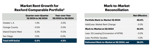
Issues like COVID-related population outflows, a temporary drop in immigration, and major port delays and labor disputes have suppressed tenant demand for infill industrial space in SoCal, while at the same time there has been the biggest spike in new deliveries of industrial space in the region in many years.
Fortunately, though, the industrial construction pipeline in SoCal has made a round trip back to where it was before COVID-19, while market rent rates are holding most of their gains.
REXR July Presentation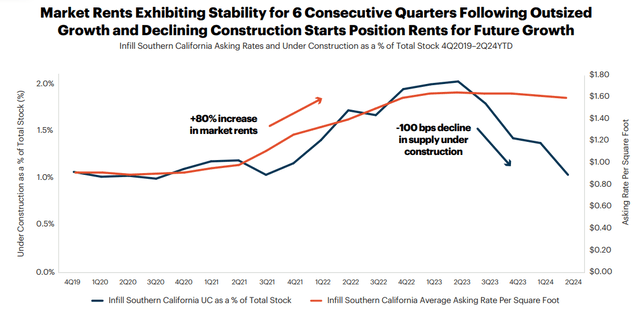
This contributes to my confidence that the SoCal infill industrial market will return to its prior state of supply shortage and robust rent growth after the market works through the current soft patch.
How long will that take? I don’t know.
But I am confident that a best-in-class landlord like REXR will suffer below-average downside for as long as the softness lasts and enjoy above-average upside when the recovery begins.
I think this could literally be a once-in-a-lifetime opportunity to buy shares of a blue-chip REIT like REXR at a dividend yield of 3.3% and core FFO multiple of 21x. That’s about 35% below its 5-year average valuation. Even if REXR never returns to its nosebleed valuation levels, downside appears very limited while upside appears very high.
Best of all, given the embedded NOI upside of about 35% from marking in-place rents to market and redeveloping space in its current portfolio, I think REXR’s dividend growth should continue to be strong in the years ahead, even if market rents stay flat.
Editor’s Note: This article discusses one or more securities that do not trade on a major U.S. exchange. Please be aware of the risks associated with these stocks.
Read the full article here